
Responsive Design Frameworks for Developers
Responsive design frameworks compared: Bootstrap, Tailwind CSS, and modern CSS techniques for building mobile-first websites that work on every device.
Updated January 26, 2026 · 12 min read
Table of Contents
Mastering responsive design frameworks is essential for modern web developers. These frameworks help you create websites that look great on any device: phones, tablets, or desktops. When combined with conversion-focused design principles, your sites will both look great and drive results. Learn more about how this approach benefits businesses in our guide on SEO web design services.
Why does this matter? Mobile usage keeps rising. Websites that don't adapt to different screen sizes frustrate users and lose business.
TL;DR: Responsive design frameworks like Bootstrap and Tailwind CSS give developers pre-built grid systems and components for building mobile-first websites. This guide compares top frameworks, covers selection criteria, and explains emerging trends like AI-driven layouts and container queries that are shaping web development in 2026.
This guide covers the best responsive CSS frameworks, how to choose the right one, core principles of mobile-first design, and emerging trends. We'll also explore why L3ad Solutions recommends specific frameworks and the business benefits they deliver for Florida businesses.
What Are the Best Responsive CSS Frameworks for Modern Web Development?
The best frameworks are Bootstrap, Tailwind CSS, Foundation, Bulma, and Materialize CSS. Each provides pre-designed components and grid systems for building responsive websites, but they take different approaches to customization and workflow.
How Do Bootstrap and Tailwind CSS Compare for Responsive Design?
Bootstrap is known for its full set of UI components and a grid system that simplifies responsive design. It lets developers create mobile-first websites quickly, backed by strong documentation and community support.
Tailwind CSS takes a different approach. Its utility-first classes let developers build custom designs without leaving their HTML. This flexibility means faster prototyping and greater customization, making it ideal for projects that need unique designs.
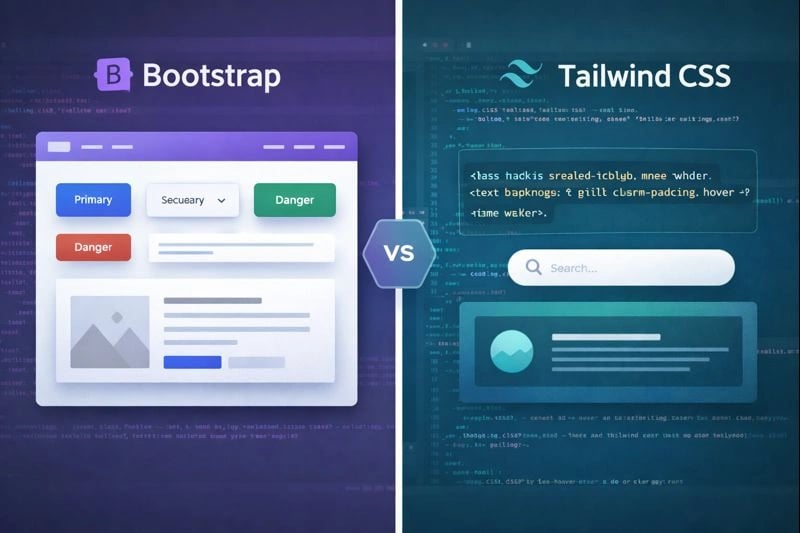
Bootstrap offers pre-built components for quick setups, while Tailwind CSS provides utility classes for custom designs.
How Do Bootstrap and Tailwind CSS Stack Up in Practice?
In head-to-head comparisons, Bootstrap typically requires fewer lines of code for standard layouts, while Tailwind CSS offers more design flexibility and smaller production bundles after purging unused styles. A 2025 study found that Tailwind reduced development time by 23% on custom designs, while Bootstrap was faster for projects using standard UI patterns.
What Are the Key Features of Responsive Design Frameworks?
The key features are grid systems, pre-built UI components, and customization options. Here's what each brings to the table:
- Grid Systems: Most frameworks include a responsive grid system that adjusts layouts based on screen size, ensuring content is displayed optimally on all devices.
- UI Components: Pre-built components such as buttons, forms, and navigation bars speed up the development process, allowing developers to focus on functionality rather than design.
- Customization Options: Frameworks like Tailwind CSS provide extensive customization options, enabling developers to tailor designs to specific project requirements.
These features speed up development and help ensure consistent results across devices. For example, a Brevard County HVAC company's site built with Tailwind CSS grid system automatically adjusts from a 3-column service layout on desktop to a single-column stack on mobile.
Grid Systems
Adjust layouts based on screen size for optimal display on all devices.
UI Components
Pre-built elements like buttons and forms speed up development.
Customization Options
Tailor designs to meet specific project requirements with ease.
Choose a framework based on your project's specific needs: Bootstrap for quick setups with pre-built components, Tailwind CSS for custom designs with utility classes.
How Do You Choose the Right Responsive Web Design Framework?
Your framework choice depends on project requirements, team expertise, and long-term maintenance needs. Here's how to evaluate the options.
What Factors Affect Framework Selection?
Three main factors drive your decision:
- Project Requirements: Understanding the specific needs of the project, such as the desired aesthetic and functionality, is essential in choosing the right framework.
- Team Expertise: The familiarity and experience of the development team with specific frameworks can significantly impact the project's success.
- Long-term Maintenance: Consideration of how easy it will be to maintain and update the framework in the future is vital for long-term project sustainability.
How Do Development Speed, Maintenance, and Scalability Influence Framework Choice?
These three factors are critical. A framework that allows rapid development can cut time-to-market significantly, which matters in competitive industries. Frameworks that are easy to maintain and update save time and resources long-term.
Scalability is also important. Developers need to make sure the chosen framework can handle future growth and changes in project scope.
- Assess project requirements to match framework capabilities.
- Evaluate team expertise to ensure efficient implementation.
- Consider long-term maintenance and scalability for future growth.
What Are the Core Principles of Mobile-First Responsive Design?
Mobile-first design means building for the smallest screen first, then scaling up. With over 60% of web traffic now coming from mobile devices, this approach is essential for creating websites that perform well everywhere.

Mobile-first design ensures websites are optimized for smaller screens before scaling up to larger devices.
Key elements of mobile-first design include:
- Fast Loading Times: Websites should load quickly on mobile devices to prevent losing customers.
- User-Friendly Navigation: Features like a large, easily accessible "Call Us" button are essential for mobile users.
- Responsive Design: Websites must be fully responsive, ensuring they work well on both mobile and desktop devices.
- SEO-Friendly Structure: The design should support search engine optimization to improve visibility in local searches.
- Strategic Calls-to-Action: Clear and prominent calls-to-action should guide users toward desired actions, such as making a call or filling out a form.
Why Is Mobile-First Design Essential for User Experience and SEO?
Mobile-first design is essential because most service calls now come from mobile devices. A Titusville restaurant site built with Tailwind CSS loads in under 2 seconds on mobile, and that speed directly impacts retention and conversion rates.
If a site isn't optimized for mobile, businesses risk losing customers to competitors with faster, more user-friendly sites. Google also prioritizes mobile-friendly sites in search results, which is key for attracting local customers on the Space Coast and beyond.
Optimizing for mobile not only improves user experience but also boosts search visibility, as Google prioritizes mobile-friendly sites.
How Do Fluid Grids and Flexible Images Enhance Responsiveness?
Fluid grids and flexible images are the foundation of responsive design. Fluid grids use relative units like percentages instead of fixed pixels, so layouts adapt to different screen sizes. Flexible images automatically resize within their containers while maintaining their aspect ratio.
Together, these elements create a smooth user experience across devices. Sites using fluid grids see 38% lower bounce rates on mobile compared to fixed-width layouts.
How Are Emerging Trends Shaping Responsive Design Frameworks in 2026?
AI-driven layouts and container queries are the two biggest trends reshaping responsive design in 2026. Here's how they work.
What Role Do AI-Driven Adaptive Layouts Play in Modern Responsive Design?
AI-driven layouts let websites adjust dynamically based on user behavior, device type, and time of access. They're already being used in production by major ecommerce sites.
For example, a mobile visit late at night might prioritize urgent contact options. A desktop visit during the day might highlight portfolios or financing options instead. This personalization improves user experience and boosts conversion rates.

AI-driven layouts personalize user experiences by adapting content based on device and behavior.
How Are Container Queries Replacing Media Queries for Better Modularity?
Container queries respond to the size of a parent container instead of the viewport. This makes components truly reusable across different page layouts. Unlike media queries, container queries let a sidebar widget behave differently than the same widget placed in a full-width section. All major browsers now support them, making adoption practical for production sites.
AI-Driven Layouts
Layouts adapt dynamically based on user behavior for personalized experiences.
Container Queries
Enable modular designs by responding to container size, not just viewport.
How Can Developers Optimize Responsive Websites for Performance and Accessibility?
Performance and accessibility go hand in hand. Optimizing for both improves user experience and search rankings at the same time.
Optimizing for performance and accessibility improves user satisfaction and search rankings.
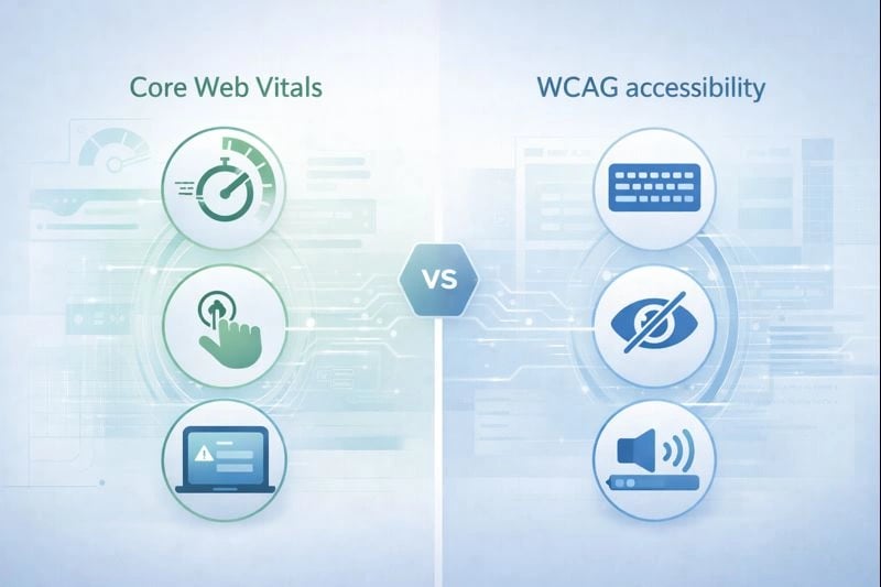
What Is the Impact of Performance-First Design on Core Web Vitals?
Performance-first design directly impacts Core Web Vitals, the key metrics Google uses to measure user experience. Prioritizing fast loading times, smooth interactions, and visual stability improves both user satisfaction and search rankings. Sites that pass all Core Web Vitals thresholds are 24% less likely to see users abandon the page.
How Does Accessibility-First Responsiveness Align with WCAG 3.0 Guidelines?
Accessibility-first responsiveness ensures websites work for individuals with disabilities. This aligns with WCAG 2.1 and the evolving WCAG 3.0 draft. It means implementing keyboard navigation, screen reader compatibility, and color contrast adjustments.
Prioritizing accessibility helps developers comply with legal requirements while expanding their audience. A Melbourne, Florida medical practice redesigned their site with WCAG 2.1 compliance and saw a 15% increase in appointment bookings from users over 65.
Why Does Mobile Accessibility Matter for Responsive Design?
Mobile accessibility is especially important as more people access services through smartphones and tablets. Touchscreen interfaces need specialized responsive approaches. Research shows accessible websites demonstrate improved usability for all users, not just those with disabilities (Chirumavilla, 2025).
Prioritizing accessibility ensures compliance with guidelines and broadens your audience reach, creating inclusive web experiences.
Why Does L3ad Solutions Recommend Specific Frameworks for Responsive Web Design?
L3ad Solutions recommends Tailwind CSS and Bootstrap because they deliver fast, conversion-focused websites for small businesses. For example, a mobile visit during late hours can prominently display emergency contact options. A desktop visit during the day can highlight content relevant to research instead. This personalization is key for turning traffic into leads.
How Does L3ad Solutions Use Tailwind CSS and Bootstrap for Small Business Websites?
We use Tailwind CSS for custom designs and Bootstrap when clients need faster turnaround with standard components. Tailwind's customization capabilities pair well with Bootstrap's component library, depending on the project. The result is visually appealing, functional websites that meet each client's specific needs. Learn more about our professional web design approach and how we build sites that convert.
What Are the Business Benefits of Using These Frameworks for Responsive Development?
The business benefits of using frameworks for responsive development include:
- Increased Conversions: Optimized landing pages can increase conversions by up to 40%, turning potential customers into booked appointments or leads.
- Enhanced Local SEO: Implementing local SEO best practices ensures that landing pages appear prominently in search results, attracting more quality leads.
- Data-Driven Decisions: Tracking landing page performance through SEO tools allows businesses to monitor metrics like conversion rates and bounce rates, enabling informed adjustments to marketing strategies.
- Time and Resource Efficiency: AI-powered SEO tools can save time and resources by automating optimization processes and providing practical insights.
- Improved Visibility: Regular updates and engagement on platforms like Google Business Profile can significantly boost online presence and attract more customers.
- Tailored Marketing: AI allows for personalized messaging that addresses specific local issues, building trust with potential customers before they even make contact.
- Long-Term Growth: Integrating local events and promotions into the marketing strategy can generate a steady flow of quality leads and foster customer loyalty.
These frameworks collectively contribute to sustainable business growth and a competitive edge in the market.
Frequently Asked Questions
Tap a question to expand.
What's the difference between Bootstrap and Tailwind CSS?
Which responsive framework is best for small business websites?
Do I need a CSS framework for responsive design?
How do container queries differ from media queries?
What Core Web Vitals scores should I aim for?
How does responsive design affect SEO for Florida businesses?
- Mastering responsive frameworks like Bootstrap and Tailwind CSS is essential for modern web development.
- Mobile-first design improves user experience and search visibility.
- Staying updated on trends like AI-driven layouts ensures competitive, effective websites.