Conversion Web Design for Local Service Businesses
Conversion web design for local service businesses: fast mobile loading under 3 seconds, visible click-to-call numbers, real reviews upfront, one clear CTA per page.
web designconversion optimizationlocal business
TL;DR
• For a local service business, web design is judged by booked jobs, not by aesthetics.
• The four patterns that consistently lift conversion: mobile load under 3 seconds, phone number visible above the fold with click-to-call, social proof (real reviews, real photos) in the hero area, and a single primary call to action per page.
• Most 'modern' design trends (full-screen video, parallax, complex animations) hurt conversions on local-service traffic.
A small-business website's only real job is to convert search traffic into phone calls and form submissions. Everything else, the design language, the copy voice, the brand polish, is supporting infrastructure for that one job. Most local-business websites we audit fail at the basic job and obsess about the supporting infrastructure.
This pillar covers the patterns that actually move the conversion rate, in order of impact.
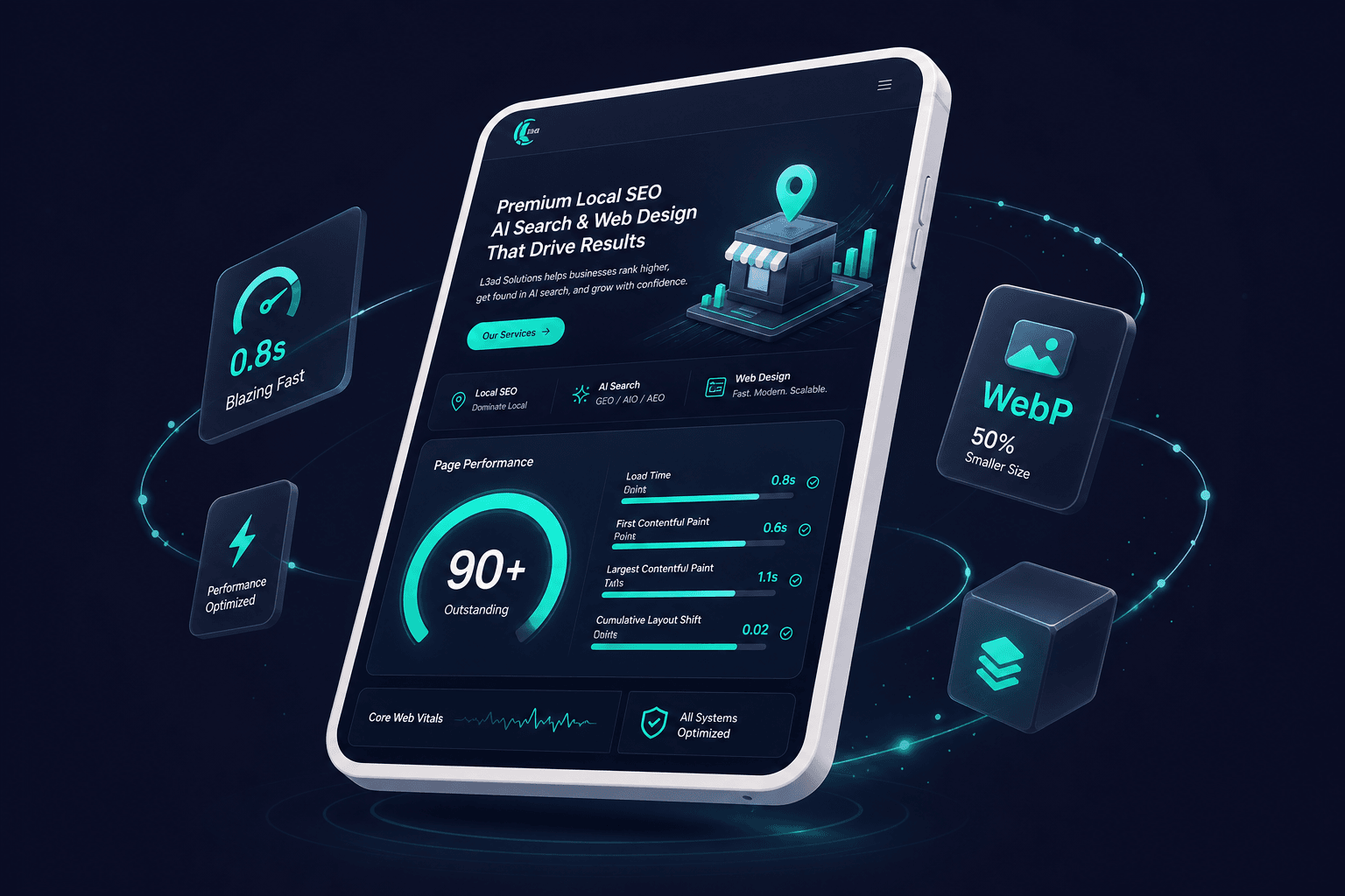
Most local service queries happen on phones. Google's data is clear: bounce rate goes up sharply past 3 seconds and brutally past 5. A site that loads in 6 seconds on a 4G connection loses roughly half of mobile arrivals before they see the homepage.
How to check: run your site through Google PageSpeed Insights or our Page Speed Analyzer. Both give you a 0-100 mobile score. Anything under 60 is hurting you significantly. 80+ is the goal.
The most common speed killers for local service sites:
Multi-MB hero images that aren't compressed
Auto-playing video backgrounds (worst offender)
Heavy fonts loaded synchronously (block first paint)
Third-party widgets (chat, review feeds, social embeds) that pile on render-blocking JS
Fixes are usually unglamorous: compress images to WebP under 200KB, replace video backgrounds with static photos, font-display: swap, lazy-load third-party widgets after first interaction. Each fix is small; together they often double mobile scores.
Mobile speed under three seconds is the highest-impact conversion factor for local service sites.
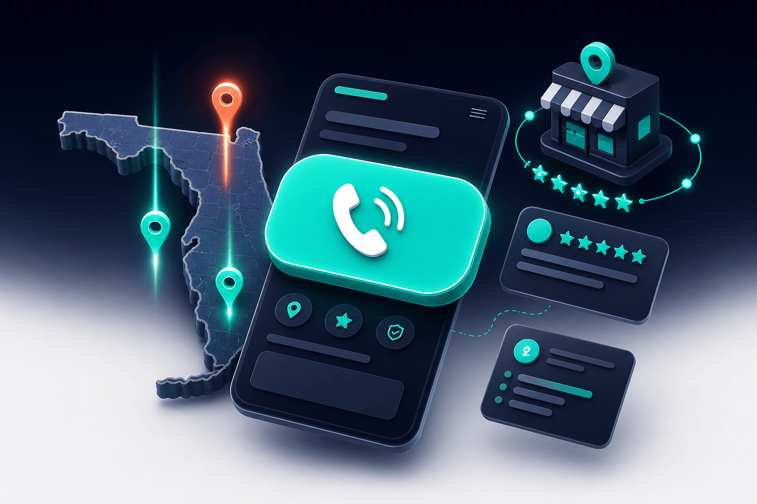
The single most-clicked element on most service-business sites is the phone number. It should be:
Visible without scrolling on mobile (above the fold)
Tap-to-call enabled (<a href="tel:..."> markup)
Repeated in the footer and contact page
Not buried inside a contact form
Most owners hide the phone number behind a form, hoping to capture leads that prefer typing. The data says: every form-only site we've audited has improved its lead volume by 15-40% just by adding the phone number prominently. People who want to call call. People who want to fill a form fill a form. Don't make the call-preferring crowd dig.
A prominent click-to-call phone number above the fold is the single most-clicked element on service business sites.
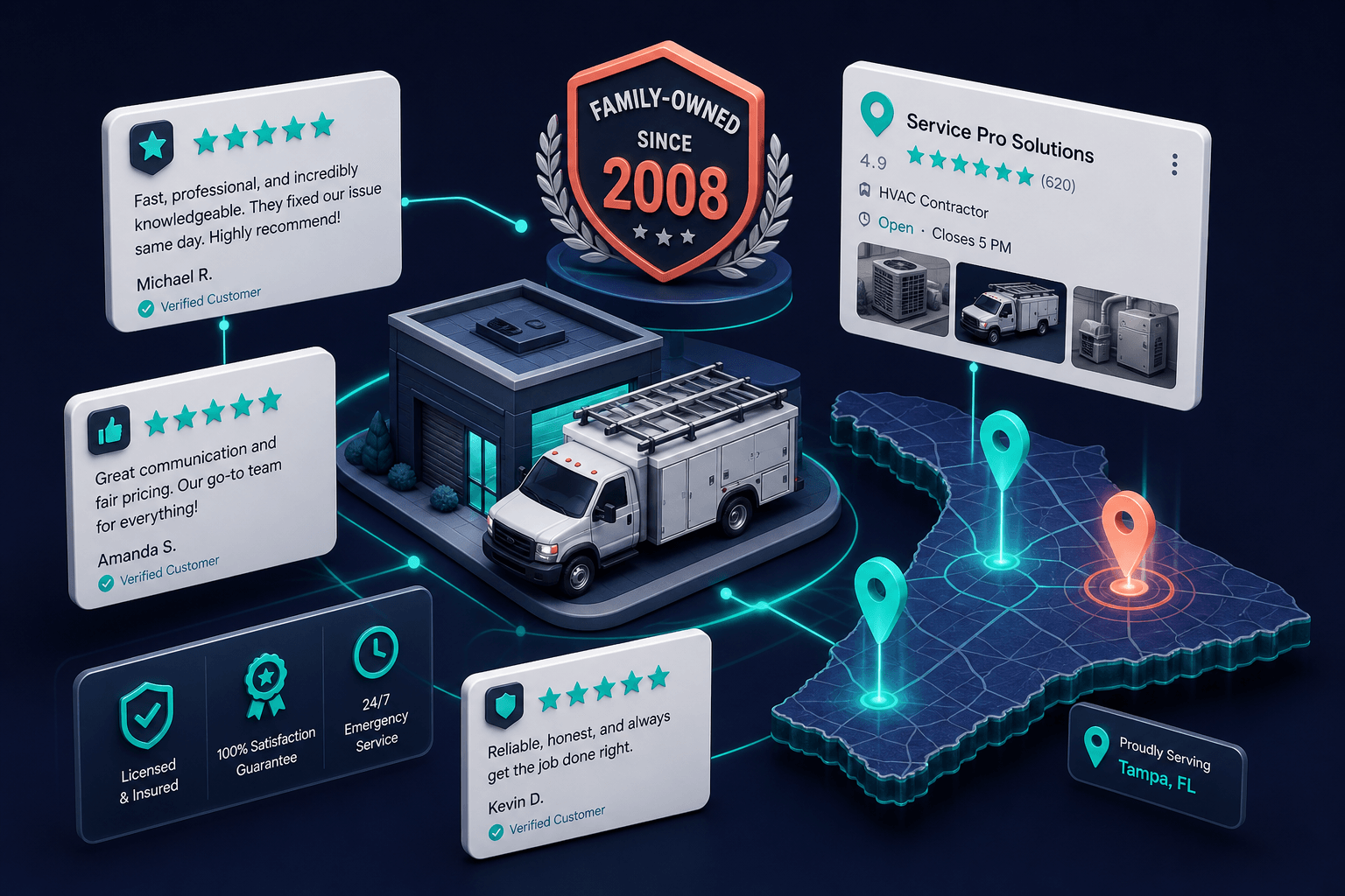
Within the first 1.5 seconds of landing, a visitor decides if your business looks legit. Trust signals that consistently lift conversion:
Real reviews with reviewer names (or at least first name + last initial)
A genuine photo of the team, the truck, or the work, not a stock image
Years in business, if multi-generational ("family-owned since 1992")
Local reference: city served, service area, a landmark mentioned
Proper licensing if applicable (license number visible, not "fully licensed")
What hurts trust: stock photos of suit-wearing strangers, vague claims ("trusted by hundreds"), no specific city or area mentioned, missing license/contractor numbers in regulated trades.
Trust signals placed in the hero area build instant credibility within the first 1.5 seconds.
Pages with three competing CTAs ("Call Now" / "Get Quote" / "Schedule Inspection" / "Download Guide") convert worse than pages with one. Decision fatigue is real.
Pick the highest-value action for each page. For most service-business pages it's "call." For a few specific pages (downloadable guides, deeper-funnel content), it might be a form. Make that action the visually prominent one. Other actions can exist as secondary text links, but they shouldn't compete visually with the primary CTA.