
Mobile-Friendly Website Design for Local Businesses
Mobile-friendly website design techniques for local businesses: responsive layouts, page speed, Core Web Vitals, thumb-friendly navigation, and mobile SEO.
Updated January 26, 2026 · 10 min read
Table of Contents
• Mobile-first design improves both rankings and user experience. • Page speed under 3 seconds reduces bounce rates significantly. • Thumb-friendly navigation increases engagement on mobile. • Core Web Vitals directly impact your Google rankings.
More than half of all web traffic comes from mobile devices. If your website isn't optimized for mobile users, you're losing customers. See our guide on conversion-focused web design for strategies that turn visitors into leads.
This guide covers the essential techniques for creating a mobile-friendly website. You'll learn practical steps to improve page speed, design thumb-friendly navigation, and boost your mobile SEO. For broader website optimization strategies, check out our web design tips for local businesses.
Why Mobile-First Design Matters
Google uses mobile-first indexing. This means Google looks at your mobile site first when deciding where to rank you.
A poorly optimized mobile site will hurt your rankings, even if your desktop site looks great.
If your site doesn't work well on phones, you'll lose both customers and search rankings.
Key Benefits of Mobile-First Design
- Better search rankings – Google prioritizes mobile-friendly sites
- Lower bounce rates – Users stay longer on fast, easy-to-use sites
- More conversions – Mobile-optimized CTAs drive more calls and form submissions
- Improved user experience – Happy visitors become customers
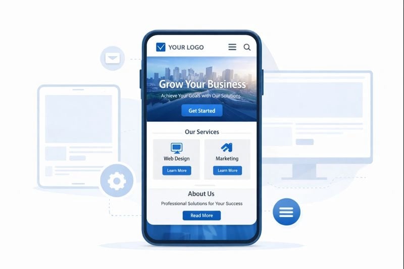
Mobile-first design starts with the smallest screen and scales up.
Mobile-First vs. Responsive Design
These terms are often confused. Here's the difference:
| Approach | What It Means |
|---|---|
| Mobile-First | Design for phones first, then add features for larger screens |
| Responsive | Create layouts that adapt to any screen size |
The best approach? Use both together.
Start with a mobile-first mindset. Then use responsive techniques to ensure your site looks good on tablets, laptops, and desktops.
The Building Blocks of Responsive Design
Three key techniques make responsive design work:
- Fluid grids – Use percentages instead of fixed pixels for layouts
- Flexible images – Images that scale within their containers
- Media queries – CSS rules that apply different styles based on screen size
How to Optimize Mobile Page Speed
Page speed is critical. Over 50% of mobile users leave a site that takes more than 3 seconds to load.
- Compress images to reduce file sizes
- Enable browser caching for repeat visitors
- Minify CSS and JavaScript files
- Use a content delivery network (CDN)
- Reduce server response time
Test Your Speed with These Free Tools
- Google PageSpeed Insights – Get scores and specific recommendations
- GTmetrix – Detailed performance analysis
- WebPageTest – Test from different locations and devices
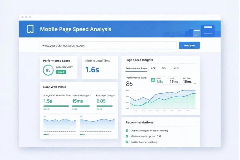
PageSpeed Insights shows exactly what's slowing down your site.
Understanding Core Web Vitals
Google measures three key metrics for user experience:
| Metric | What It Measures | Target |
|---|---|---|
| LCP (Largest Contentful Paint) | How fast main content loads | Under 2.5 seconds |
| INP (Interaction to Next Paint) | How quickly the page responds to clicks | Under 200ms |
| CLS (Cumulative Layout Shift) | How stable the page layout is | Under 0.1 |
Meeting these targets improves both user experience and search rankings.
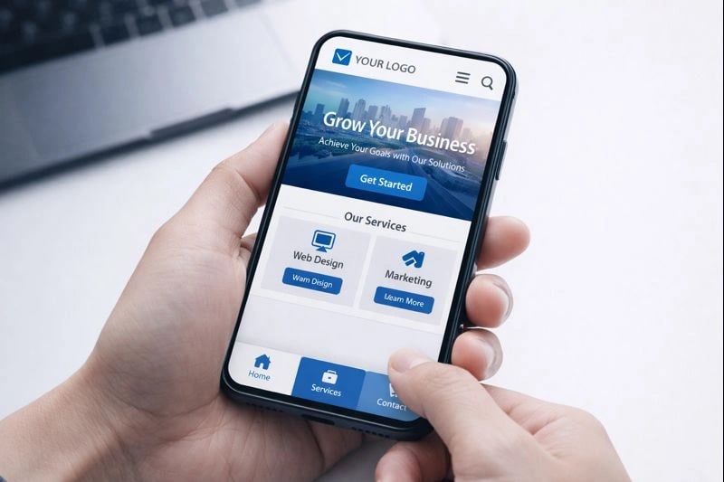
Designing for Thumb-Friendly Navigation
Most people hold their phones with one hand. Your navigation should work with that.
Bottom Navigation
Place key buttons within thumb reach.
Large Tap Targets
Make buttons at least 44x44 pixels.
Simple Menus
Limit navigation to essential items.
Effective Mobile CTAs
Your call-to-action buttons should be:
- Visible – Don't hide them in menus
- Action-oriented – Use words like "Call Now" or "Get Quote"
- Thumb-accessible – Place them where users can easily tap
- High contrast – Make them stand out from the background
The green zone shows where thumbs can easily reach on most phones.
Mobile Content Best Practices
Content that works on desktop often fails on mobile. Here's how to adapt:
Keep Text Scannable
- Use short paragraphs (2-4 sentences max)
- Add descriptive subheadings
- Break up content with bullet lists
- Highlight key points in bold
Avoid These Common Mistakes
- Intrusive pop-ups – Google penalizes sites with annoying interstitials
- Tiny fonts – Use at least 16px for body text
- Horizontal scrolling – Content should fit the screen width
- Unplayable media – Avoid Flash or unsupported video formats
Mobile SEO for Local Businesses
Nearly half of all Google searches have local intent. Mobile optimization is essential for local businesses.
When someone searches "plumber near me" on their phone, they're ready to call. Your site needs to make that easy.
Optimize Your Google Business Profile
Your GBP listing often appears before your website in mobile searches. Make it count:
- Complete every field – Hours, services, attributes
- Add quality photos – Show your work and team
- Respond to reviews – Both positive and negative
- Post updates regularly – Keep your listing active
- Enable messaging – Let customers contact you directly
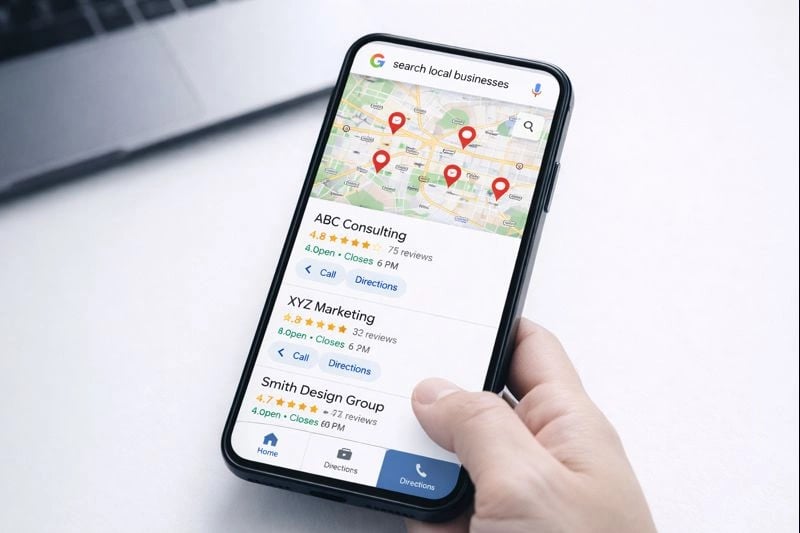
Mobile users see your GBP listing prominently in local searches.
Testing Your Mobile Site
Regular testing catches problems before they hurt your rankings or drive away customers.
- Run Google's Mobile-Friendly Test monthly
- Check PageSpeed Insights after any changes
- Test on actual devices (not just emulators)
- Verify forms and CTAs work on mobile
- Review Core Web Vitals in Search Console
Tools for Cross-Device Testing
- BrowserStack – Test on real devices in the cloud
- Chrome DevTools – Built-in mobile emulation
- Responsively – View multiple screen sizes at once
Next Steps
Mobile-friendly design isn't optional anymore. It's essential for both user experience and search rankings. Our mobile-first web design services help local businesses create fast, responsive websites that convert.
Start with these high-impact actions:
- Test your current site – Use PageSpeed Insights to find issues
- Fix speed problems first – They affect both rankings and conversions
- Optimize your CTAs – Make it easy for mobile users to contact you
- Update your GBP – Complete your profile for local search visibility